
Culver's
designing in-store & drive-thru digital menu boards to improve the guest ordering experience

Culver's • May - August 2025 • UX & Lead Visual Designer
Culver’s partnered with our team to digitize their in-store and drive-thru menu boards, replacing their static, paper-based menus.
I led visual design for both in-store and drive-thru menu boards, developing three visual themes and two final layouts. I prioritized menu items based on customer data and operational needs, testing layouts that balanced clarity, information density, and physical constraints."
I worked closely with a Design Director and an Associate UX Designer, along with a few strategists, and interfaced directly with the Culver's Creative Director and design team.
Problem
Culver’s is a fast-growing quick-service restaurant chain with over 1,000 locations across the U.S., known for its signature ButterBurgers®, fresh frozen custard, and Midwestern hospitality. As the brand scaled, its static, paper-based menu system struggled to keep up with the pace of growth and evolving customer expectations.
With this redesign, Culver’s is striving for a 3% sales lift through front-counter and drive-thru transactions, while retaining or increasing speed of service and order accuracy.
The Boards
The legacy menu boards were:
-
Cluttered with text, making quick decisions difficult in high-pressure environments.
-
Lacking clear hierarchy, which made it hard to discover new or featured items.
-
Static, offering no flexibility for quick updates or seasonal promotions.
-
Required a 5–8 week lead time for changes (factoring in review cycles, printing, and physical installation) making it difficult to stay agile.
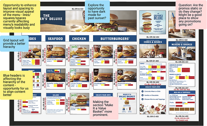
Legacy Drive-thru menu with audit notes

Legacy In-store Menu with audit notes
Process
We followed a collaborative, iterative design process that blended content strategy, user needs, and operational constraints to arrive at a solution that worked for everyone (but especially the customer!)
Research & Content Audit
To ground our design decisions, we reviewed existing menu boards from Culver’s as well as competitors like McDonald’s, Dunkin’, and Subway. This helped identify common patterns in layout, information hierarchy, and guest flow across the industry.
In parallel, we worked closely with the content strategist to audit Culver’s full menu evaluating items based on
-
popularity
-
profitability, and
-
operational complexity
Based on sales data, we recommended removing or reducing the size of low-performing or unprofitable items (like the Grilled Reuben Melt, which made up just 1% of sales), and reallocating that space for high-impact, high-value items (like Cheeseburgers, at nearly 28% of sales).
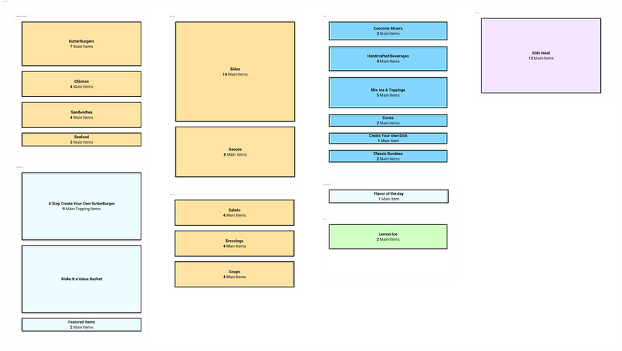
This informed how we prioritized and grouped content across the boards.
Site Visits & Interviews
We visited two high-volume Culver’s locations and observed ordering behavior both in-store and in the drive-thru. We also interviewed 28 guests to better understand habits, frustrations, and decision-making patterns.
What we heard
What we designed
-
Added color to make it easy to find & added images to allow children to point to what they want
"Most of the time I go to Culver's because my kids want to go to Culver's."
Children play a significant role in influencing ordering decisions
"We drive past 2 Culver's and decide if we stop based on the better Flavor of the Day."
“Flavor of the Day” (FOD) is super popular but the interior menu board with FOD info fails to capture attention
-
Make FOD large and fun with subtle motion, using bold typography and contrasting colors to catch attention
-
Gave it a permanent anchored placement so it's easy to find in any store
-
Identified popular core items via data and ensured they remained on the menu
-
Introduced space reserved for highlighting and encouraging new or limited time offers (LTOs)
"I always order my usual. I would try new items, I guess I just haven’t noticed them."
Local regulars are open to trying new things, but tend to order “the usual"
"I tried to find the chicken tender quantities [on the menu] and had to just ask the cashier."
Guests typically spend about one and a half to two minutes reading the menu before approaching to order
-
Prioritize a clean visual hierarchy and logical grouping of items to help customers quickly locate and compare options, even under drive-thru time pressure
Design Strategy
We designed with real-world constraints in mind: how far customers stand or sit from the menu, minimum readable type size, legal disclaimers, and the size & number of screens.
Our goals:
-
Increase readability and menu clarity
-
Create a modular system that works across drive-thru and in-store experiences
-
Use data to optimize content and layout
Business requirements:
-
One "Promo" or "limited time offer" (LTO) slot per board
-
Balance prep time and popularity (e.g., retained fried chicken on the drive-thru despite longer cook times, given its strong guest appeal)
- Make sure it still "feels like Culver's"
Physical Requirements
Outdoor layout:
three vertical 55" screens, customers in car at ~14 ft distance

In-store layout:
four horizontal 55" screens, customers standing ~10 ft away

I created two layouts that tested different content strategies and flows, keeping in mind the 3-vertical or 4-horizontal screen requirement.
Section Blocking
"Bookends" Layout
-
Pulls burgers to the primary board position establishing it as the cornerstone
-
Reads in a logical meal build manner and reduces criss-crossing
-
Places Kids' Menu directly next to dessert menu for maximum cross sell placement

-
Uses a more logical ordering and reading flow of Entrees > Sides > Drinks > Dessert
-
Anchors entrées in the front and custards in the back, so a guest will scan the middle while they go from Burgers to dessert
-
Different layout than legacy menus, so even locals will have to scan the whole menu, potentially increasing sales
"Center out" Layout
-
Keeps main items centralized-ish for optimal viewing from all registers
-
Kids' Menu comes first since kids typically order before parents
-
Updated version of legacy menus so it's more familiar to patrons

*as it turns out, there's not much wiggle room for the drive-thru layout once the "order confirmation screen" requirement is placed into the equation, so we went with bookends.
Visual Design
Components
The legacy boards gave every item equal weight, which made it hard for guests to focus or prioritize.
To solve this, I created a modular system that introduces visual hierarchy, allowing key items to be elevated while simplifying others. Each product card adapts based on space and importance, making the system both clear and flexible across screen formats and menu types.
Hero item

Featured item

Line items


I established a clean type hierarchy to improve scanability, allowing customers to quickly browse and focus on the sections that matter to them (even without relying on color yet!)
I also designed a distinct visual style for "customizable" sections, using higher contrast (light text on dark background) and cursive accents to draw attention and unify these areas.

Themes & Moodboards
To explore different visual directions, I built three distinct themes, ranging from brand-faithful to more playful and unexpected.
I then applied each theme to a full menu mockup to help ground the conversation with the client in concrete examples, avoiding the ambiguity that often comes with abstract design language.
1. Classic for a Reason
Culver’s is a modern classic. Blue skies, fresh custard, and timeless American flavor. Like Levi's and Coca-Cola, it’s not retro; it’s enduring.
This concept leans into what already works but sharpens it with modern clarity and polish.


2. Food is the Focus
Let the flavor do the talking. This direction modernizes the Culver’s look with cleaner layouts, more whitespace, and beautifully isolated food photography that makes the menu items the true stars.


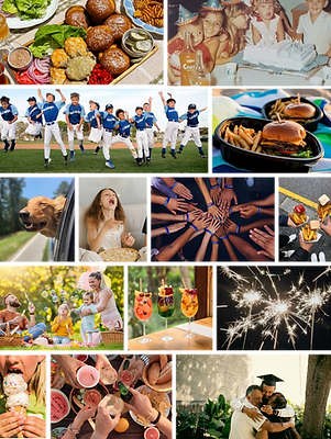
3. Part of your Joy
Culver's is where joyful moments happen. After the game. After the recital. You showed up and so did your community.
This direction leans into the emotional side of the experience—family, connection, celebration—and invites more joyful colors and personality into the design.


several weeks and many iterations later...
Final Screens
The final system blended the strengths of all three directions: keeping the familiar feel of Classic, the clarity of Food is the Focus, and the warmth and joy of Part of Your Joy. This gave Culver’s a modern, flexible design that still felt like them.
New Drive-thru Menu


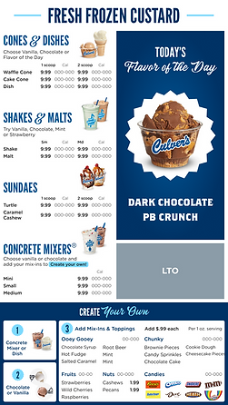
New In-store Menu


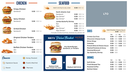

The final screens bring clarity to complex menus, helping guests scan quickly, make confident choices, and discover new items.
Looking Forward
After hand-off, the Culver’s team will test the new menu designs in two pilot stores, with the goal of expanding to 40 locations by the end of 2025. By 2029, the aim is to roll out the new system to all 1,000+ restaurants nationwide.
As the rollout continues, the modular, template-driven design system enables rapid testing of content, promotions, and seasonal changes. Compared to the legacy process (which took 5–8 weeks) updates can now be made overnight, reducing turnaround time by over 90% and significantly lowering costs.
Future iterations may include dynamic pricing, time-of-day content (aka dayparting), or regional customization. Excited to see where the team takes this and grateful to be part of the journey!
Final Thoughts
This was my first project that combined digital AND physical design and I thoroughly enjoyed the unique challenges it presented.
-
You'd think that designing with more space for items would be easier, BUT!
Designing the 4 in-store screens was oddly challenging since we had to include all the items. This led to getting creative to make sure the layout stayed clear and navigable, even with all the content.
Designing for the 3 drive-thru screens was surprisingly easier. Even though it's 25% less space, we prioritized the highest selling drive-thru items and it was easy to remove low-performing or slower items.
-
I do wish I had a better way to visualize and interact with conditions closer to real life. A friend had a 55" TV so I used it as a test to make sure things were correctly sized! Better than nothing!
-
The biggest thing this revealed was the need to take the TV frame into consideration, since it overlaps a small amount with the screen's live area.

-
I've never been to Culver's (which would have been interesting for me to go as a first-time customer!) but now I crave it. My parents went for the first time -without me- and had rave reviews.